Goals of Assignment Five
Create a Scatterplot with Trendline in Excel
Calculate Correlations Using SPSS
Interpret Correlations from a Scatterplot and SPSS Output
Use the US Census Site to Download Data and Shapefiles
Join US Census Data and Other Data
Report Results
Part I: Correlation
Introduction
A scatterplot was created using data, consisting of sound levels in decibels and distance of feet, provided by Dr. Ryan Weichelt and a trendline added using Microsoft Excel (Figure 2). A correlation analysis was then run in SPSS, with the results presented in Figure 3.
Definitions
Scatterplot: Diagram representing value displays for two variables using Cartesian coordinate plots, with one variable acting as the X value and one acting as the Y value. The trendline represents the direction of the relationship with a downward-trending slope meaning a negative relationship and an upward-trending slope meaning a positive.
Correlation: Numerical representation between pairs of variables. Correlations test the strength of the relationship between the variables, with a value of +1 representing a perfect positive relationship (as X increases Y also increases) and a value of -1 representing a perfect negative relationship (as X increases Y decreases, for example). A correlation only shows the relationship between two variables at a time but a correlation matrix (Figure 3) allows for several correlations to be presented in one output file.
Strength of Correlations:

Figure 1: Correlation Strengths
https://blog.majestic.com/case-studies/majesticseo-beginners-guide-to-correlation-part-5/
https://blog.majestic.com/case-studies/majesticseo-beginners-guide-to-correlation-part-5/

Figure 2: Scatterplot of Sound Level and Distance
b. Show the results of the Pearson Correlation using SPSS.

Figure 3: Pearson's r Correlation for Sound Level and Distance Variables
d. What is the hypothesis?
Null Hypothesis: There is no linear relationship between sound level and distance.
Alternative Hypothesis: There is a linear relationship between sound level and distance.
e. Summarize your findings.
The scatterplot (Figure 2) shows a trendline that is decreasing as distance increases, suggesting a negative relationship between the two variables. This scatterplot is considered to represent a strong association as the data points are tightly packed along the trendline. The Pearson r Correlation (Figure 3) confirms this and the null hypothesis is rejected as our 2-tailed significance is .000, which is less than the significance level of .01. An r value of -.896 is considered a strong negative relationship; there is a decrease in sound levels at distance.
Correlation Matrix

Figure 4: Correlation Matrix Between Ethnicity and Multiple Economic Variables, Detroit, USA
Hypothesis
For the sake of simplicity, one null hypothesis and one alternative hypothesis will be presented.
Null Hypothesis: There is no linear relationship between ethnicity (white, black, asian, hispanic) and bachelor's degrees, median household income, median home value, and job type (manufacturing, retail, and finance).
Alternative Hypothesis: There is a linear relationship between ethnicity (white, black, asian, hispanic) and bachelor's degrees, median household income, median home value, and job type (manufacturing, retail, and finance).
Results
All results use the data portrayed in Figure 4.
Ethnicity and Bachelor's Degree
The linear relationships between ethnicities, whites (r = .698), blacks (r = -.305), and Asians (r = .559), and bachelor's degree are all significant at the .01 level, two-tailed, while the linear relationship between Hispanics and bachelor's degree is not, with an r value of -.058. The null hypotheses would be rejected for all ethnic groups except for Hispanics, as the two-tailed significance is .068, which is greater than the significance level of .01. There is as significant linear relationship between whites, blacks, and Asians and bachelor's degrees but not between Hispanics and bachelor's degrees. Using Figure 1, the strength of each of these relationships can be assessed, so that an r of .698 is considered to represent a moderately strong positive relationship while an r of -.058 is considered to represent a very low strength negative relationship.
Ethnicity and Median Household Incomes
The linear relationships between ethnicities, whites (r = .554), blacks (r = -.408), and Asians (r = .388), and median household incomes are all significant at the .01 level, two-tailed, while the linear relationship between Hispanics (r = -.078) and median household income is significant at the .05 level, two-tailed. The null hypothesis was rejected for all ethnic groups as the two-tailed significance values are all less than the significance levels.
Ethnicity and Median Home Values
The linear relationship between ethnicities, whites (r = .486), blacks (r = -.362) Asians (r = .436). and Hispanics ( r = -.092), and median home values are all significant at the .01 level, two-tailed. The null hypothesis was rejected for all ethnic groups as there are significant linear relationships between all ethnicities and median home values.
Ethnicity and Manufacturing Jobs
Blacks (r = -.085) and Asians (r = .077) were the only ethnicities to have significant linear relationships at the .01 level of significance, two-tailed, and .05 level of significance, two-tailed, respectively. Both have very low correlation strengths. Whites (r = .011) and Hispanics (r = -.009) both have very low and insignificant correlation strengths. The null hypothesis was rejected for blacks and Asians but not for whites or Hispanics.
Ethnicity and Retail Jobs
Whites (r = .184), blacks (r = -.146), and Asians (r = .259) all have significant linear relationships at the .01 level of significance, two-tailed, while Hispanics (r = -.004), did not. The null hypothesis was rejected for whites, blacks, and Asians as there is a significant linear relationship between their ethnicities and retail jobs.
Ethnicity and Finance Jobs
Only Asians had a significant relationship with finance jobs (r = .097). Whites ( r = -.007), blacks (r = -.042), and Hispanics (r = -.034) all have very low negative correlations with finance jobs. The null would was rejected for Asians but not for the other three ethnic groups.
Conclusion
Whites and Asians have positive linear relationships between their ethnicities and what would be considered to be the preferred variables of bachelor's degrees, median household incomes, and median home values. Blacks and Hispanics have negative linear relationships with these preferred variables. It appears that whites and Asians are better educated, which may influence their higher positive correlations with median household income and median home values. Whites also have slightly stronger positive correlations with these three variables than Asians do. When it comes to jobs, blacks and Hispanics have negative relationships among the three job variables used in this analysis, while whites and Asians have positive linear relationships with these three job variables, except for finance, where whites have a very low negative linear relationship with that variable. We cannot imply causation from correlation but this data is very interesting. Blacks and Hispanics do not seem to attain the same level of education that whites and Asians do and also experience lower rates of employment in manufacturing, retail, and finance positions. It seems, stressing that ethnicity does not cause the linear relationships we see here, that there are reasons for these patterns that are observed here. It would take require a rigorous inferential analysis to determine what the potential causes of the discrepancies between ethnicity and these economic variables are.
Part II: Spatial Autocorrelation
Introduction
The Texas Election Commission (TEC) commissioner, Dr. Ryan Weichelt, wants to see if there is a clustering of voting patterns in the state of Texas by county. The results of this analysis, comparing the spatial patterns of percentage of democrat votes between the election of 1980 and 2012 and voter turnout in those elections, will be provided to the governor to see if election patterns have changed over the past 32 years. The TEC suggests that the determination of spatial autocorrelations will provide the data needed to see if a clustering is occurring. A spatial autocorrelation is a correlation of a variable with itself through space. For example, if there are counties nearer each other that are similar in levels of voter turnout in 1980, these counties would have a high, high relationship. The use of autocorrelation will determine if there are spatial patterns that exist between the variables that are to be examined for this analysis.

Figure 5: Moran's I Output
Dr. Ryan Weichelt
The output is placed into four quadrants of comparison. Each value, by counties this analysis, is compared to each other value and are placed in the following categories:
High, High (+,+) areas that contain high values of a variable that are surrounded by areas that contain high values of a variable.
High, Low (+,-) areas that contain high values of a variable that are surrounded by areas that contain low values of a variable. Outliers
Low, High (-,+) areas that contain low values of a variable that are surrounded by areas that contain high values of a variable. Outliers.
Low, Low (-,-) areas that contain low values of a variable that are surrounded by areas that contain low values.
The value of Moran's I ranges from -1 to +1, like a Pearson's r correlation but, unlike a Pearson's r correlation, a negative or positive value does not imply the direction of the correlation but, rather, the degree to which a variable is clustered. A positive Moran's I is more clustered while a negative value is less clustered. Local indicators of spatial autocorrelation (LISA) maps provide a visual representation of clustering.
Methodology
A Texas county shapefile and Hispanic population data by Texas county were downloaded as zip files from the United States Census Bureau at http://factfinder2.census.gov/faces/jsf/pages/index.xhtml. The percentage of Hispanic population by Texas county data from the population file was added to an Excel file provided by Dr. Ryan Weichelt that contained Texas election data for voter turnout and the percentage of the vote that for the Democratic candidate for the years 1980 and 2012. ArcMap was then opened and the Excel data file was joined to the Texas shapefile using Geo_ID. This data was exported as a new shapefile to be used in Geoda by clicking on "Data" then "Export Data" and "Save as Type" was changed to shapefile as Geoda can only open shapefiles. Geoda was then opened and "File" was clicked, followed by "New Project From" and the Texas shapefile was opened. Before a spatial autocorrelation could be performed, a spatial weight had to be created by going to "Tools" to "Weights Manager" and then to "Create". The "Add ID Variable" was then selected, which opens up "Add New ID Variable Name" followed by selecting "Add Variable". The final step was selecting "Rook Contiguity" under "Contiguity Weight" then clicking "Create". Using the "Cluster Map" box five Moran's I calculations were performed and the five output graphs and LISA maps were then added to the final report. SPSS was then used to perform a correlation matrix to better explain the data along with a map of Hispanic population percentages that was created from the mxd file created sy the beginning of this analysis, using a graduated colors scheme and the Jenks Natural Breaks (divided into 5 classes) classification method.
Results
In 1980 (Figure 6), the Moran's I value is .468058 and high voter turnout is concentrated in the Texas panhandle and a few counties in central Texas while low voter turnout is clustered in the east and southern Texas along the Mexican border. There are four high-low counties and six low-high but the majority of counties in Texas show no significant clustering. In 2012 (Figure 7), the Moran's I value is even lower, at .335851, and there is an obvious decrease in the clustering of high-high counties but there is still a pronounced low-low clustering of voter turnout in southern Texas along the Mexican border and an additional clustering of low voter turnout in the western Texas panhandle that was not present during the presidential election of 1980. The majority of counties show no clustering. In 1980 (Figure 8), with a Moran's I value of .575173, the clustering of counties with high percentages of votes for the democrat candidate, occurs in the eastern and southern parts of Texas along the Mexican border. Areas of low percentages of votes for the democrat candidate are clustered in the western part of the Texas panhandle and in central Texas. There are very few counties that are high-low and low-high and the majority show no clustering. In 2012 (Figure 9), with a Moran's I value of .695853, sees a definite shift of clustering of higher democrat vote percentages from the east to the west along with a shift of low-low clustering from the western to northern panhandle along with an increase of clustering in central Texas of counties with low vote percentages in favor of democrats. There are only three counties that are high-low and low-high while the majority of counties show no clustering. The spatial analysis of Hispanic population by percentage (Figure 10) resulted in the highest Moran's I value of .778655, which means that there is a significant clustering of Hispanic and non-Hispanic populations. The majority of the clustering of Hispanics is along the border with Mexico, in the western panhandle, and in one county surrounded by a majority non-Hispanic population. Majority non-Hispanic populations are clustered in the eastern part of the state and in one county in the western region of Texas. Figure 11 was produced to show the connections between low voter turnout and percentage democrat vote clusters in both 1980 and 2012; this chloropleth map shows the percentages of population that is Hispanic by Texas county. Voter turnout and voting pattern clusters match well with the counties along the Mexican border, which have higher percentages of Hispanic populations. The reverse holds true for areas with higher voter turnout and percentage of democrat vote. In 1980 voter turnout was clustered in northern and central Texas. In 2012 voter turnout was also clustered in these areas but to a lesser extent (note the lower Moran's I in 2102 voter turnout as compared to 1980 voter turnout). In 1980 and 2012 clusters of low percentages of democrat votes occurred mainly in the northern counties of Texas and counties of central Texas. These regions have lower percentages of Hispanic citizens. Figures 10 (clustering of populations) and 11 (chloropleth map of Hispanic populations by county percentages) when compared, match up very well. The western counties of Texas, especially along the border with Mexico, into the panhandle have higher percentages of Hispanic populations than the northern or eastern counties in Texas. It appears that Hispanics vote in lower numbers and, when they do vote, do so mainly for democrats. It also appears that voter turnout has decreased in counties that vote for democrats at higher percentages. To test these hypothesis a correlation matrix was created. This matrix is presented in Figure 12. The hypotheses were as follows:
Hypothesis Set 1
Null Hypothesis: There is no linear relationship between the percentage of Hispanics and four other variables: voter turnout in the presidential elections of 1980 or 2012, or percent democrat vote in the presidential elections of 1980 or 2012
Alternative Hypothesis: There is a linear relationship between the percentage of Hispanics and voter turnout 1980 or 2012 or percent democrat vote in 1980 or 2012.
There is no linear relationship between percent democrat vote and percent Hispanic population (r =
.093) for the presidential election of 1980, so the null was not rejected as the observed two-tail significance level of .139 is greater than the .01 level. There is however, a significant positive
correlation between percent democrat vote and percent Hispanic population (r = .718), two-tailed, .01 significance level. There are also significant negative linear relationships between percent Hispanic
populations and voter turnout in 1980 (r = -.407) and 2012 (r = -.718). It appears that while Hispanics have become more likely to vote for the democrat candidate, they are voting less in presidential elections. The null is rejected in both of these cases as the r correlations are both significant to the .01 level, two-tailed.
Hypothesis Set 2
Null Hypothesis: There is no linear relationship between voter turnout by county (both 1980 and 2012) and percent democrat vote by county in the presidential elections of 1980 or 2012.
Alternative Hypothesis: There is a linear relationship between voter turnout by county (both 1980 and 2012) and percent democrat vote by county in the presidential elections of 1980 or 2012.
In 1980, the correlation between voter turnout and percent democrat is a negative linear relationship (r = -.612), significant to the .01 level, two-tailed, and the null was rejected. In 2012, the correlation between voter turnout and percent democrat is also a negative linear relationship (r = -.623), significant to the .01 level, two-tailed, and the null was rejected. This supports the observation that less people are voting in counties where democrats receive higher percentages of votes.
Voter Turnout 1980


Figure 6: Moran's I and LISA Map of Voter Turnout in 1980
Voter Turnout 2012


Figure 7: Moran's I and LISA Map of Voter Turnout in 2012
Presidential Election, % Democrat Vote, 1980


Figure 8: Moran's I and LISA Map of Presidential Election 1980, Democrat Vote Percentage
Presidential Election, % Democrat Vote, 2012

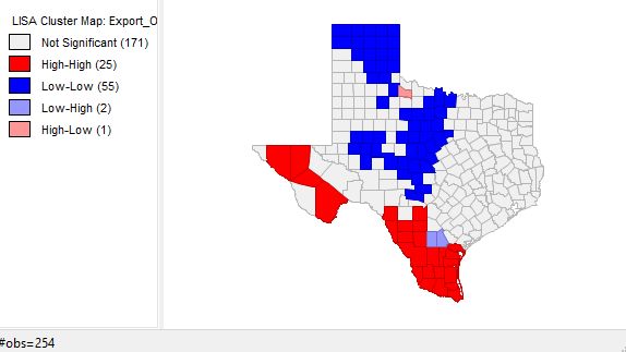
Figure 9: Moran's I and LISA Map of Presidential Election 2012, Democrat Vote Percentage
% Hispanic


Figure 10: Moran's I and LISA Map, Hispanic Percentage of Population

Figure 11: Hispanic Population by Percentage, Texas, 2010 Census Data
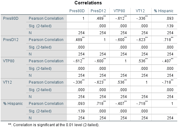
Figure 12: Matrix Correlation
Conclusion
We have seen a general pattern in this analysis; counties with high percentages of Hispanics do not vote in high numbers but when they do vote it is primarily for the democrat candidate. Voter turnout is higher in areas where there are lower percentages of people voting for democrat candidates. These patterns follow the proportions of Hispanics and non Hispanics living in Texas. Hispanics tend to be concentrated in the western counties and along the border of Mexico while non-Hispanics tend to concentrated in the panhandle, central and eastern counties in Texas. Voter turnout is low statewide but is especially low among Hispanics. To determine what causes this low turnout among Hispanics would require additional analyses as correlations and spatial autocorrelations cannot be used to infer causes of the linear relationships observed in this report. They do tell us, however, that there are relationships between these variables that are quite interesting that can guide additional research.


